

To style an input type=”color” in CSS, you can customize its appearance using the following properties. However, keep in mind that the actual color picker UI is controlled by the browser and can’t be fully styled. You can style the input itself, such as its width, border, and background.
<!DOCTYPE html>
<html lang="en">
<head>
    <meta charset="UTF-8">
    <meta name="viewport" content="width=device-width, initial-scale=1.0">
    <title>Input Color Example</title>
    <style>
        input[type="color"] {
            width: 50px; /* Set the width of the color input */
            height: 50px; /* Set the height */
            border: none; /* Remove the default border */
            cursor: pointer; /* Change cursor on hover */
            outline: none; /* Remove outline */
            border-radius: 5px; /* Optional: rounded corners */
        }

        /* Optional: add some styling when the input is focused */
        input[type="color"]:focus {
            box-shadow: 0 0 5px rgba(0, 123, 255, 0.5); /* Add a shadow effect */
        }
    </style>
</head>
<body>

    <label for="colorPicker">Choose a color:</label>
    <input type="color" id="colorPicker">

</body>
</html>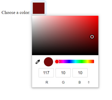
